Wednesday, April 27, 2016

Architecture preview 2


Surroundings
This photo shows surroundings because it shows all of the nature around it. The wide shot of the Eden project allows the viewer to see where it is and what happens. 

Lighting
The artificial lighting in this picture enhances the architecture and showcases the hexagons which are a focal point of the building. This makes the picture more interesting and defines the architecture.  
Repetition/ Patterns
The pattern of the hexagons makes the photo more interesting and put together and it also gets in closer so you can see what the building is for. 
Shapes and angles
The point of view in this picture makes the circles stand out and the hexagons are more present in the photo. It shows the different sizes and shapes that create the building. 
Details
By getting up close, the photographer captures what the Eden project is really about. The flowers show that it's about nature and the different biomes. 


Monday, April 25, 2016

Architecture preview

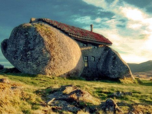
Stone House, Guimarães, Portugal
It was built in 1974 for a family so they could have a vacation/ rural house. It is built along a hillside in the fafe mountains in northern Portugal. It was considered private but people kept coming to visit it and now can be visited. It doesn't say how much it cost to build, especially because parts of the walls are boulders and it was meant to be a private home. This house is interesting because it incorporates the natural boulders into the house. I chose this building because it was unique and didn't change the way things were around it but adapted to them. It makes the house seem more hidden and mysterious. The boulders make the house abstract. 
Eden Project, UK
It was built in 2000 and it is located in bodelva , Cornwall. The architect was Nicholas grimshaw. It cost 141 million euros to build and is open for visitors. It is famous for the interesting done architecture and the way that it creates real life mini biomes. I chose the Eden Project because it is cool because of the concept and the architecture. There are many interesting aspects of the building and I like the way that the building looks imaginary and futuristic. 

Kansas City public library
The library was built/ opened in 2004 and the architect was Mary Elizabeth colter and many others. It cost 10,000 dollars to construct. It's a public building and is available for visiting. It was created to make a fun place for people to have access to books. This building is built to look like a shelf of books wig huge book spines along the exterior of the building. 
I chose this building because I like how it is a lot more creative than other libraries. I think the playfulness of the design will want to encourage more people to go and check out a book. 
The UFO house, Taiwan
This house was found, so no one knows who built it or how much it cost. They are located in sanjhih, Taiwan. It can be visited. No one knows much about these houses like when they were built or why. 
I thought these were intriguing because of their abstract yet symmetric simplicity. The mystery behind them adds to the story and I like the unique way that they are stacked. 

Turning Torso, Sweden
This building is located in Malmö, Sweden. It was built in 2005 and designed by Santiago Calatrava. It is the tallest building in Scandinavia. It cost 220 million dollars to build. It can be visited and is a residential building. I chose this building because the way it turns kind of plays a trick on your eye and overall just finds a way to spice up a normal building and make it more creative. 

Magzine Cover


Wednesday, April 13, 2016

Publication- dance show

Dance Til You Drop
McCallum fine arts dance perform during the last dance show on Saturday, April 9 at McCallum high school. "I've been dancing for a while and it's fun and refreshing to come dance at McCallum and see the way they teach" says freshman, Lexi Battle. 

Talented Tap Dancers
The fine arts students at McCallum high school show off their salsa/ tap dance skills as they dance to live music. "This dance is my favorite because it has such a cool vibe because of the live music) says freshman, Aubrey Levine. (Second from the left)
Express Yourself
The finale dance of the show was. performed using chalk and food coloring in the performance. "This dance took a long time to learn but it was a big crowd pleaser" says junior, Perry
Hutchens. 

Monday, April 11, 2016

Planning my magazine cover

My magazine would be focused on nature and the outdoors. It would appeal to anyone that likes hiking or anything like that so it could be for all ages. The typical reader would be probably 12-65 and it would be appealing it both men and women in mostly rural but also urban areas. The title would be "The Climb" because it represents outdoor activities and it is also a pretty cool song by Miley Cyrus which is a bonus obviously. My magazine would have a fun and sophisticated vibe and it would inspire people to get outside more. I will have a color scheme of greens and blues and white and have a cool color theme that is present in nature. I am going to use fonts that mesh well together and I would model it kind of like Elle magazine where they use a variety of fonts and colors. I would keep the colors and fonts and the spacing of the words but I wouldn't keep the plain background or the coveted title. I would use a photo based magazine because nature is beautiful and that's what entices a lot of people to come outside. My first cover story will be about how keeping animals as pets is affecting the ecosystem and I will show it by having it in a bigger font and I will show the page numbers and make sure it stands out. 

Friday, April 1, 2016

My favorite cover

This is my favorite cover because of the way it captivates the viewer. It says so much in those few words and it was such big news and the cover did a good job of announcing it. It makes it so all eyes are on her and it's really powerful. It shows her choice in being who she is. 

My top five 2015 magazine covers

I think that this one is one of the best because it shows so much but is yet so simple. Just by those three words and the photo, the viewer can already see what's going on. The plain background makes the black don't look elegant and makes Caitlyn stand out more. This one is my favorite. 
This is a powerful cover because of the color scheme and the detail. It's an image based cover and her stare is intense and captures the viewer. The white flows well with the other colors and makes Adele and the title pop. The way they photographed her makes it seem more like you are getting to see her private life. 
I like this spread because the monochromatic theme. The black and white makes the shadows dramatic and the picture has a lot of contrast. The font isn't too prominent but it's different color helps them to be seen. The whole spread flows nicely because of the theme they chose. 
This spread catches the eye of the viewers really well. The intense colors help make the cover stand out and the focus is in the center of the page which makes it look symmetric and balanced. The rich colors and simplicity draw the eye to the center. It also has a powerful image that makes people want to see what is inside. 
This cover is powerful because of the mellow colors and the background help focus in on the athlete. This cover is showing what a true athletes body looks like and I think it really helps get the point across. The photo is really captivating and it makes the viewer want to see more. 

The four types of magazine covers

Image based magazine covers are the most common approach. It has one or a few people on the cover and its posed so the person is looking at the photographer. The plain background of this gives an advantage because it draws more attention to the person, which is normally a celebrity that causes more people to buy the magazine. 

Illustration based magazine covers usually represent something funny or unusual. They have an animated drawing for the cover that wasn't photographed.  This type of cover has been used since the 30s and famous magazines like the New Yorker often use this. An advantage would be that it is sometimes easier to get the point across using this one because it can show symbolism and metaphors and things that can't be captured on camera. 

Type based magazine covers have text as the prominent part of the cover. This is not as rare as illustration based. It usually shows something shocking and powerful. It has an advantage because sometimes words can be better at getting a message across. They are increasing in popularity. 

Concept based magazine covers can be all three of the previous approaches combined. They have to be understandable by almost any crowd, and they get the point across quickly. This's usually shows up in business magazines. 


Give helpful magazine tips

1. Make the cover interesting so the people will want to see what's inside.

2. Make the cover informative so viewers know what it's about.

3. Be creative to help it stand out/ think about what color scheme you want and the choices of what fonts etc. to use to get the point across. 

4. Prove that it's worth the money and time to read it.

5. Make the magazine recognizable (so you know what company it is) and have a theme and make sure the title is prominent.