Wednesday, June 1, 2016

Spring Final :)!!!!

Bokeh/ Macro
Settings: shutterspeed- 1/160 | ISO- 100 | aperture- f5.6
I like this photo because of the contrast between the colors, and the detail of the flower. The shallow depth of field helps make the photo have a better focal point, and draws the attention to it. Then right lighting lifts the mood of the picture and makes the colors seem more saturated. 
Settings: shutterspeed-1/60 | ISO- 400 | aperture- f5.6
I like this photo because of the way the light seeps through the trees. The bokeh effect really enhances this and gives the background more contrast. Because this is a macro photo, I think that the way the focal point takes up most of the frame and is centered draws attention to it. 
Settings: shutterspeed- 1/250 | ISO- 400 | aperture- f9
I like this photo because it shows rule of thirds, and the shallow depth of field makes the picture a lot more put together. I like the variety of colors in the photo and the background does a good job complimenting the flowers. 
Emotion in black and white
Settings: shutterspeed- 1/50 | ISO- 100 | aperture- f4.5
I like this picture because of the high contrast between the dark and the light. The lighting is almost Rembrandt, and the dramatic shadows allow the black and white to enhance the picture. The concentrated face that Sylvia is making goes well with the angle. 
Settings: shutterspeed- 1/160 | ISO- 100 | aperture- f7.1
This picture is happy and cheerful because the lighting created a spotlight on Sylvia. This picture also shows rule of thirds and the background isn't simple but still contributes to the subject. 
Settings: Shutterspeed- 1/1000 | ISO- 1600 | aperture- f5.6
I like this candid picture because it has a really shallow depth of field and the subject fits perfectly in the frame. She has a playful expression and the lighting is soft and subtle. 
Family
Settings: Shutterspeed- 1/250 | ISO- 400 | aperture- f8
I like this photo because it is powerful and not like other typical photos. The colors all work nicely together with the different neutral shades. This shows a slight parallelism between the ropes and his arms. I chose to take this picture because my brother is always trying to improve his fitness. 

Settings: shutterspeed- 1/30 | ISO- 2500 | aperture- f4
I like this picture because the floor creates leading lines and I got lower to the ground so it could provide a different angle than your usual dog picture. This picture again has neutral colors that help compliment my dog and I liked the way that parts of her aren't in focus because of the different range. 
Settings: shutterspeed- 1/60 | ISO- 400 | aperture- f4
In this picture my mom is kindly making me a quesadilla for dinner. I chose to take this photo because my mom is always working to make us happy. I like the different colors and angles that help put the picture together. 

I just like these photos

^ and here is a crappy photoshop I made of Jacqueline onto Edna from the incredibles. 

Saturday, May 28, 2016

bokeh

I I bokeh is blurring the background. It's the effect of the blur that makes it look a certain way. It's the way the lense renders out of focus points of light. 

Photographers like this because it focuses in on a subject really well and makes the light look aesthetic. 

In order to maximize bokeh in a photographers in their images they must buy a lense that has auto focus or that has fast shutterspeed and a small aperture. It needs to be able to be adjusted so you can easily get the effect. it should also have a longer lense so there can be greater distance between the subject and the background. 


Publication 1


The dark knight rises
McCallum blue brigade students perform at their spring show on April 22. They performed many different styles of dances, including the ones from competition. "The first night al of us were pumped up on adrenaline so we were all excited and then the second night we were sad to see the seniors leave so everyone was sad" says freshman, Mackenzie Remaley. 
Split up
The McCallum drill team, blue brigade, performed a disco dance at the spring show on Friday. "This dance was really fun and energetic, the crowd seemed to like it too." Says Karel Tinkler, a freshman. 
Lift your spirits
At the spring show for Blue Brigade, these McCallum dancers performed stunts by lifting their peers above their heads. "It takes a lot of practice and deduction to be on the team" says junior, Emma Irvin.

Thursday, May 26, 2016

publication lee elementary

Taking the LEEp
Previously known as Robert E. Lee Elementary, this local elementary school decided to be renamed due to the fact that Robert E. Lee was a leader in the confederacy. "it is going to be weird to see our old school being renamed, I'm so used to just saying lee" said freshman, Nadia Freeman. 
Name CalLEEng
Lee Elementary changed their name this past weekend to Russel Lee, a famous photographer during the depression era. There has been a lot of controversy about the subject because some say that they don't think it's a big enough issue to rename it. "Normally schools are named after political figures, it's cool that it will have a photographer" days Audrey Sayer, a freshman. 
New Lee to be
Due to the change of names from Robert E. Lee elementary to Russel Lee, this elementary school will have to make some changes to adapt to the new name. "I think it could be exciting to have some change around here" says second grade teacher and former student, Wren Nokes. 


Wednesday, May 11, 2016

The present

The story unfolds when the boy gets up and the viewer can see his disability. The moments that seemed powerful or effective where the ones when he rejected the puppy because of it's missing no leg, and when we see that the boy is also missing a leg. The one that elicits the most emotion from me is when the dog keeps falling and is rejected but still is finding a way to be happy. The message I can take from this is that you shouldn't be quick to judge things or that differences can bring people together etc.the filmmaker does this by using different angles and showing the different expressions of the characters, they also use music to set the tone. 

Jump start your photography

My top ten favorite are
1. Learning a new lighting technique- I would look at articles and see the different ways to shoot using light and I would try to take pictures showing the different ways. 
2. Loot at popular photo blogs- I would go on well known photo blogs and look at the pictures that seem powerful to me and then see why and try to incorporate that in my pictures in my own way. 
3. Look at your cd covers- I think this one is great because you can look at the reasons why these photos were chosen. I would see what I like about them or try to remake them with my own spin on it. 
4. Look 360- since we are always looking forward, I would do this to push myself to look at the different angles and directions of where I am. Then I can see what makes the photo the most interesting. 
5. Use a prop in an interesting way- this one struck me because I feel like it will make my photos differentiate from eachother and allow me to just be more creative with my surroundings. 
6. Shoot an item 7x, make each one unique- we did a photo challenge like this and I liked it a lot. This one will allow me to see the effects of having different perspectives on the subject and would give my photos more variety. 
7. Shoot a sporting event- I think this one is a good one because there are a lot of oppurtinities at sporting events and it would be great to shoot some other aspects than just the event. 
8. Photo a day project- I think this one would help me see what I like to photograph and make me see what I should improve on. 
9. Shoot in the dark- this one will push my limits as a photographer because it is hard to get a good quality photo in the dark so I would like to see what I can do and help improve my skills. 
10. Tell a story in 5 pictures- this would help me get the point across in my pictures. I could use composition and technique to convey a message to the viewer. 

Monday, May 9, 2016

Mirrorless Camera

I think that you should get the new camera because although it won't make too much of a change, it will be a lot more convenient. The smaller size will make it easier for students to use them and they won't have to carry around as much un-necessary equipment. Plus, the other cameras are old and so it might be a good thing to get new cameras that are up to date. These cameras also have a better auto focus, which eill be very useful in this class. It has an advantage when it comes to camera modes, the mirrorless camera makes switching modes a lot easier, so you won't have to keep changing settings and can instead spend that time setting up to take a great photo.

Thursday, May 5, 2016

Photo manipulation revisited

I think that you should present the photo without the arm. It doesn't change the story or the view of the photo, it's basically just removing a distracting object. It won't affect anyone or anything, except it makes it look like there are less people there but I think that is okay. 

Photo challenge finalists

8- 4 votes
I think this one would be fun because I made it up and anything I make up is going to be amazing. 

16- 4 votes
I think this assignment could get our class excited and motivated to take pictures. It would allow people to see how the same subject can be photographed in different ways. 

11- 2 votes
I think this photo challenge is good because it lets people have freedom with their photography and will let our class get to know each other and have variety. 

Tuesday, May 3, 2016

Portfolio review 2

I really like this portfolio and j think it has some really powerful photos along with stories. One thing I would change if I were you is that I might change is that I would put the performances at the end and football season at the beginning so it will flow better. The story with Jacqueline's mom is really powerful and I like the way you put it in there so it will stand out because I think it is one of the key points of the portfolio. The pictures don't really go well together, but I think that their creativity help them fit together anyways. The captions help to explain what is important about the photo and it creates a mini story. These captions probably don't need to be that long but I think it's okay. I really like the first couple of pictures and I think they are very powerful, but as you go on they decrease slightly in composition where as I think that it should get better as you look at it. I don't mean to be harsh, I think it's a really great portfolio. Which one got honorable mention? For me, there was a little bit too much about the protest about abortion... I think it is interesting but it doesn't really have to do much with McCallum. I think you could have maybe focused in more about the interesting and cooler aspects of our school like the other portfolio did. 

Portfolio review 1

In the first portfolio, I didn't find much about it that I disliked, it seemed really put together and professional yet still playful and enjoyable. It captured the best moments of the sports year and made McCallum look like a really fun school to go to (even though sometimes it isn't). The photos do a great job at telling a story and I like the way you start with pre game pictures and end with post game photos. It shows the viewer the variety of sports that we can excel in and the story starts from the beginning and ends at the end, like a proper story should. I think that each image contributes to the story because it shows the different but realistic feelings that people have throughout the season. The captions help the pictures and tell the story behind them, although the pictures are great, the picture may not be able to tell the whole story. After I look at the portfolio is makes me excited for football season and that happy vibe etc. plus... I might be in the photos for cheer!! The flow of the pictures is really nice and I like the way they are in the order of a game. It seems like you put a lot of work into choosing which photos go where. I would make sure that it doesn't get choppy, going from sport to sport but I think overall you did a really good job. 

Photo challenge 9

Details
This photo shows gets up close to show the details of the building. I took the picture from this angle to show what the material is and what it creates. 


Patterns
This photo shows patterns because it shows the repetition of the windows and the way the architecture follows a pattern. I shot the picture from this angle so the viewer can see how much repetition there is between the bricks and the Windows. 

Lighting
The way the light hits the building in this photo creates a lot of contrast between the two side of the building. I chose to photograph the picture with the line between the darkness and the lightness going straight down the middle. 

Surroundings
This photo represents the surroundings of McCallum because it shows where McCallum is and what it is like from farther out. I went far from the school to show the view of students and see the building. By focusing on the flower, it shows the beautiful garden surrounding the pathway. 
Shapes and Angles
This photo shows shapes and angles because the railings and the stairs and the doorway all create different ones. I chose to shoot the picture from where the railings start so it will be more angled and lead to the doorway. 


Wednesday, April 27, 2016

Architecture preview 2


Surroundings
This photo shows surroundings because it shows all of the nature around it. The wide shot of the Eden project allows the viewer to see where it is and what happens. 

Lighting
The artificial lighting in this picture enhances the architecture and showcases the hexagons which are a focal point of the building. This makes the picture more interesting and defines the architecture.  
Repetition/ Patterns
The pattern of the hexagons makes the photo more interesting and put together and it also gets in closer so you can see what the building is for. 
Shapes and angles
The point of view in this picture makes the circles stand out and the hexagons are more present in the photo. It shows the different sizes and shapes that create the building. 
Details
By getting up close, the photographer captures what the Eden project is really about. The flowers show that it's about nature and the different biomes. 


Monday, April 25, 2016

Architecture preview

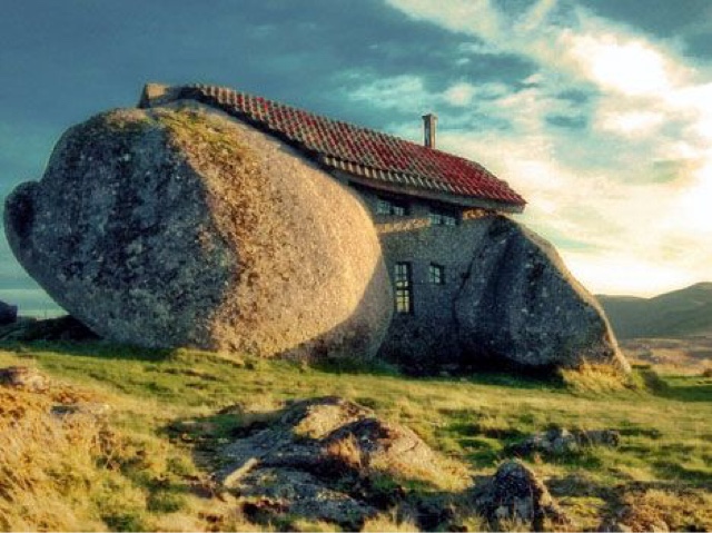
Stone House, Guimarães, Portugal
It was built in 1974 for a family so they could have a vacation/ rural house. It is built along a hillside in the fafe mountains in northern Portugal. It was considered private but people kept coming to visit it and now can be visited. It doesn't say how much it cost to build, especially because parts of the walls are boulders and it was meant to be a private home. This house is interesting because it incorporates the natural boulders into the house. I chose this building because it was unique and didn't change the way things were around it but adapted to them. It makes the house seem more hidden and mysterious. The boulders make the house abstract. 
Eden Project, UK
It was built in 2000 and it is located in bodelva , Cornwall. The architect was Nicholas grimshaw. It cost 141 million euros to build and is open for visitors. It is famous for the interesting done architecture and the way that it creates real life mini biomes. I chose the Eden Project because it is cool because of the concept and the architecture. There are many interesting aspects of the building and I like the way that the building looks imaginary and futuristic. 
Kansas City public library
The library was built/ opened in 2004 and the architect was Mary Elizabeth colter and many others. It cost 10,000 dollars to construct. It's a public building and is available for visiting. It was created to make a fun place for people to have access to books. This building is built to look like a shelf of books wig huge book spines along the exterior of the building. 
I chose this building because I like how it is a lot more creative than other libraries. I think the playfulness of the design will want to encourage more people to go and check out a book. 
The UFO house, Taiwan
This house was found, so no one knows who built it or how much it cost. They are located in sanjhih, Taiwan. It can be visited. No one knows much about these houses like when they were built or why. 
I thought these were intriguing because of their abstract yet symmetric simplicity. The mystery behind them adds to the story and I like the unique way that they are stacked. 

Turning Torso, Sweden
This building is located in Malmö, Sweden. It was built in 2005 and designed by Santiago Calatrava. It is the tallest building in Scandinavia. It cost 220 million dollars to build. It can be visited and is a residential building. I chose this building because the way it turns kind of plays a trick on your eye and overall just finds a way to spice up a normal building and make it more creative. 

Magzine Cover


Wednesday, April 13, 2016

Publication- dance show

Dance Til You Drop
McCallum fine arts dance perform during the last dance show on Saturday, April 9 at McCallum high school. "I've been dancing for a while and it's fun and refreshing to come dance at McCallum and see the way they teach" says freshman, Lexi Battle. 

Talented Tap Dancers
The fine arts students at McCallum high school show off their salsa/ tap dance skills as they dance to live music. "This dance is my favorite because it has such a cool vibe because of the live music) says freshman, Aubrey Levine. (Second from the left)
Express Yourself
The finale dance of the show was. performed using chalk and food coloring in the performance. "This dance took a long time to learn but it was a big crowd pleaser" says junior, Perry
Hutchens. 

Monday, April 11, 2016

Planning my magazine cover

My magazine would be focused on nature and the outdoors. It would appeal to anyone that likes hiking or anything like that so it could be for all ages. The typical reader would be probably 12-65 and it would be appealing it both men and women in mostly rural but also urban areas. The title would be "The Climb" because it represents outdoor activities and it is also a pretty cool song by Miley Cyrus which is a bonus obviously. My magazine would have a fun and sophisticated vibe and it would inspire people to get outside more. I will have a color scheme of greens and blues and white and have a cool color theme that is present in nature. I am going to use fonts that mesh well together and I would model it kind of like Elle magazine where they use a variety of fonts and colors. I would keep the colors and fonts and the spacing of the words but I wouldn't keep the plain background or the coveted title. I would use a photo based magazine because nature is beautiful and that's what entices a lot of people to come outside. My first cover story will be about how keeping animals as pets is affecting the ecosystem and I will show it by having it in a bigger font and I will show the page numbers and make sure it stands out. 

Friday, April 1, 2016

My favorite cover

This is my favorite cover because of the way it captivates the viewer. It says so much in those few words and it was such big news and the cover did a good job of announcing it. It makes it so all eyes are on her and it's really powerful. It shows her choice in being who she is. 

My top five 2015 magazine covers

I think that this one is one of the best because it shows so much but is yet so simple. Just by those three words and the photo, the viewer can already see what's going on. The plain background makes the black don't look elegant and makes Caitlyn stand out more. This one is my favorite. 
This is a powerful cover because of the color scheme and the detail. It's an image based cover and her stare is intense and captures the viewer. The white flows well with the other colors and makes Adele and the title pop. The way they photographed her makes it seem more like you are getting to see her private life. 
I like this spread because the monochromatic theme. The black and white makes the shadows dramatic and the picture has a lot of contrast. The font isn't too prominent but it's different color helps them to be seen. The whole spread flows nicely because of the theme they chose. 
This spread catches the eye of the viewers really well. The intense colors help make the cover stand out and the focus is in the center of the page which makes it look symmetric and balanced. The rich colors and simplicity draw the eye to the center. It also has a powerful image that makes people want to see what is inside. 
This cover is powerful because of the mellow colors and the background help focus in on the athlete. This cover is showing what a true athletes body looks like and I think it really helps get the point across. The photo is really captivating and it makes the viewer want to see more.